3D Frogger MP — a classic loop through modern design iteration.
A solo 3D multiplayer Frogger clone that I built and shipped over about five months. Rather than walk through it start to finish, I've pulled out five design decisions from across the project and explained the thinking behind each one.
Play it at froggie.eriksmedia.comLive multiplayer. You may land in a session with other players, or alone with AI opponents. Mobile-friendly. Use arrow keys, WASD, or the on-screen D-pad.
- Role
- Solo project (design, code, deploy)
- Built in
- Three.js / WebGPU, Node + TypeScript, Docker
- Timeline
- Jan – Jun 2026 (~5 months)
- Hosted at
- froggie.eriksmedia.com
3D Frogger MP is a multiplayer Frogger clone with state, AI opponents that fill in for missing humans, a phone-friendly D-pad, and a tongue-attack mechanic that lets players bump each other off logs. It runs in a Docker container on my homelab and you can play it right now.
It started as an experiment with game development, something I'd wanted to try for a long time. I included it in the portfolio because the design decisions are easy to follow here in a way they usually aren't in production work, where you can see what was chosen and why. The five sections below each cover one of those decisions.
Every object in the world is there to answer a navigation question.
The starting point was a grid, a player cube, some cars, and some logs. From there I set myself a rule: nothing goes into the world unless it answers a question the player is already asking, like where they can walk, where they'll die, or where the playable area stops. Solo 3D projects tend to drift into a generic asset-store look because decoration gets added for its own sake, and I wanted to avoid that by having each piece do some navigational work first and look nice second.
- Cubes on flat color
- Models and foliage
- Perimeter fences
- Waterfalls and moss
- Forest border and fog
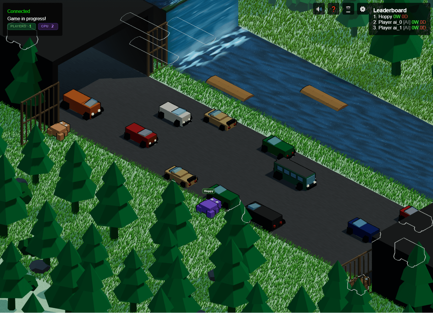
Foliage, deep-cloned so materials don't share state
The empty grid first needed something growing on it so it would register as ground to ignore rather than something to cross. The harder part wasn't the geometry. In Three.js many meshes can share a single material, so tweaking one bush at runtime would change all of them at once, and deep-cloning each instance avoided a whole class of shared-state bugs before they came up.
A real fence model, with a procedural fallback
Fences mark the edges you can't cross. The fence is a GLB model that loads asynchronously, and if that load fails on a slow connection or a missing asset, the world falls back to generating a simple fence in code instead. That fallback matters because the edge is communicating a rule, and a missing fence would leave the player unsure where the boundary actually is.
A cel outline that warns you about traffic blocked from the camera's view
A around players, vehicles, and logs ties the cartoon look together, but the reason I kept it is more practical, and the tunnels are the clearest case. A car can be most of the way behind a tunnel wall and still be a second or two from hitting you, and the outline draws a rim over the hidden part of the car, so even when the body is occluded the player still gets a clear warning that something is coming. The same pass keeps every object readable against a busy background, but in the tunnels it's doing actual safety work rather than just decoration.
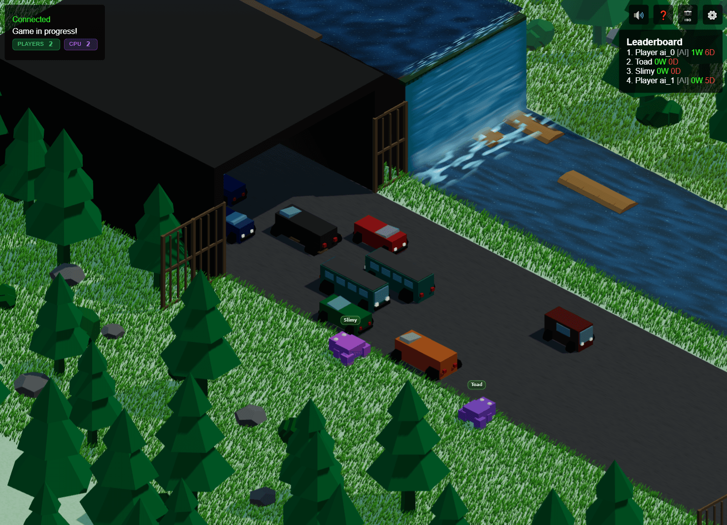
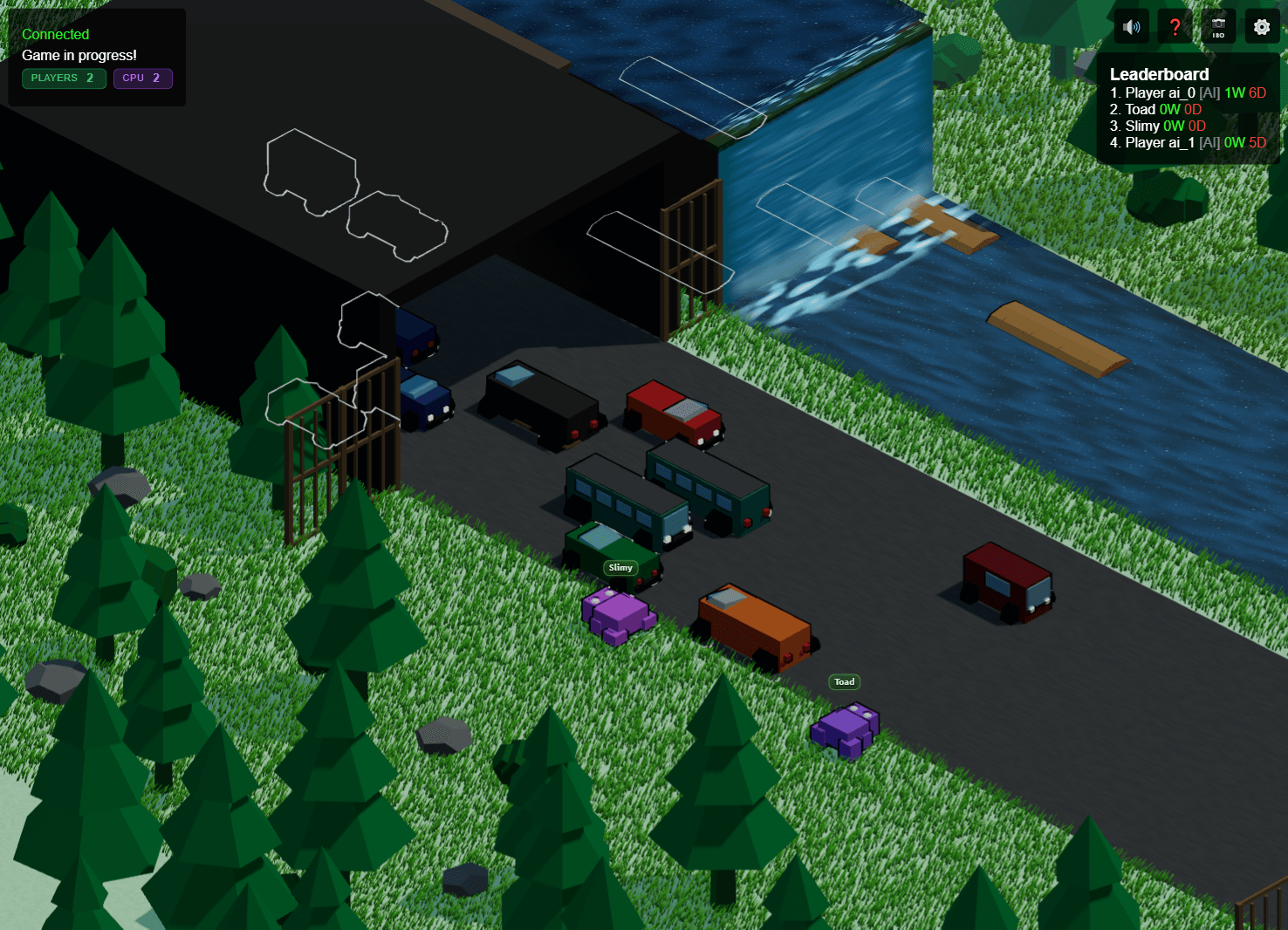
Outlines off — cars, logs, and frogs soften into the road and the tunnel shadows, and traffic sitting inside a tunnel is easy to lose.
Establishing the look of the waterfall
The river side needed its own visual treatment. The waterfalls mark where the playable area ends, and they also just make the river feel like a river. They got built up in layers over time: rock backing first, then moss accents, then an animated water surface over the lip. Later I added a shader-driven pass with a foam line, a parallax sheet, and some drifting mist, and the layer count scales down on weaker hardware so the effect simplifies instead of breaking.
The interesting part of the animation work was deciding what to animate.
For a long stretch of early development the players were just colored boxes that slid from one grid cell to the next. That was enough to test movement and collisions, and it stayed that way until the rest of the game was working. Once it was, most of what turned those boxes into something that reads as a frog came down to a handful of small animation changes, usually somewhere between five and fifty lines each, with an outsized effect on how the game feels to play.
The squish is the one I want to spend a little time on, because the design work and the technical work are so clearly separated in it. The technical side is essentially between two poses, which is straightforward. The actual design decision is choosing what to exaggerate and by how much, and then leaving the result to read on its own without explaining it to the player.
The squish only fires on intentional input
One rule here mattered more than it looks. The squish fires on a movement key press, not on every server position update. A frog riding a log drifts sideways on every tick without the player pressing anything, and if the squish fired on that drift, the animation would be showing intent the player never had. The state machine separates movement the player chose from movement they were carried into, so the squish only plays when the player actually decided to jump.
Synthesized sound, built from scratch
Late in the project I built the whole sound layer from scratch with the Web Audio API instead of using a sample library: a hop blip, the tongue zip, a squash thud, a death effect, and a goal arpeggio. Synthesizing everything kept the build free of audio dependencies and let me tune each sound to the moment it goes with. One choice that ended up mattering is that only your own frog makes sound. The AI opponents are silent, so a board full of them stays quiet instead of turning into a wall of noise.
I built a way to see the AI's thinking before I tried to tune it.
A multiplayer-only game isn't much fun when nobody else is online, so the AI exists mainly to keep the world populated when a human is playing alone. The interesting part wasn't the pathfinding code itself but the scoring function behind it: how much it should cost to wait on a log, how much drifting offscreen should cost, how hard the AI should push forward at the expense of its own safety. Those weights are basically all the AI has to go on, so changing them is really a design decision and not just a tuning detail.
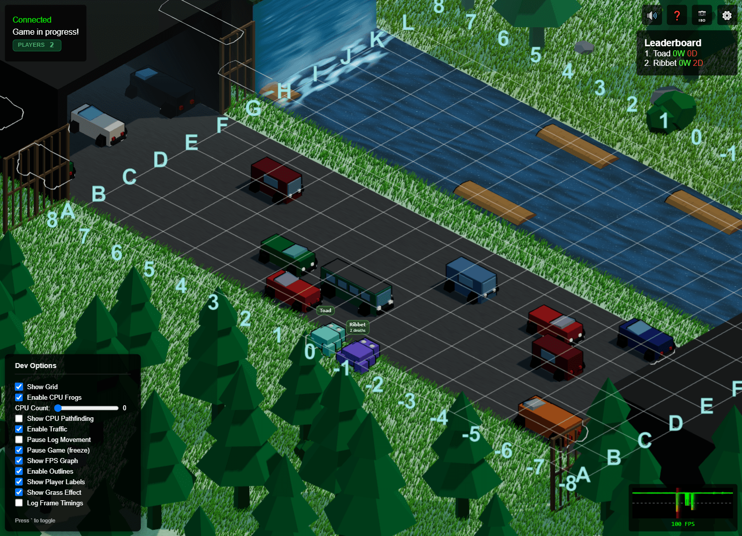
A pathfinding visualization toggle
Before tuning anything, I built a debug overlay that draws the AI's candidate moves on top of the world along with their scores. With it turned on you can see exactly what the AI is weighing at any moment, and with it off the AI just plays like a normal opponent. That overlay is what made the later tuning possible, since it's hard to adjust behavior you can't actually observe.
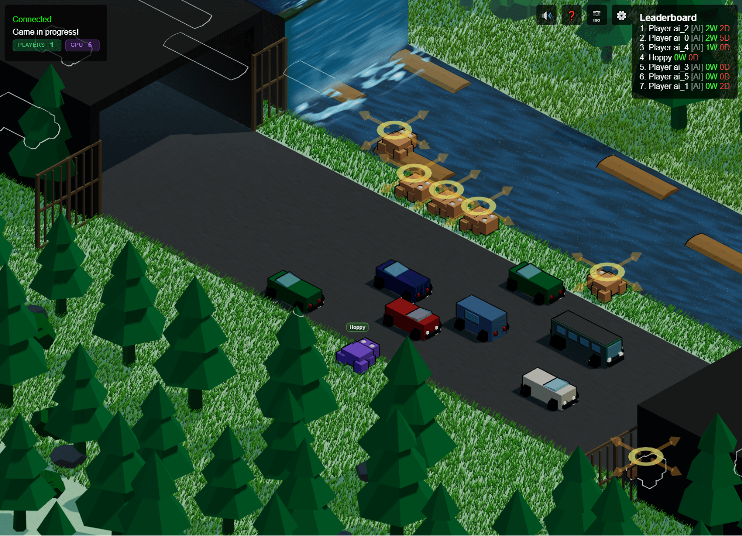
Three tuning rounds, each fixing one bad behavior
Round one slowed the AI's decision interval on logs, since the early version re-evaluated every tick and twitched around in a way that looked more like panic than skill. Round two added some safety thresholds and a backward-movement priority for drifters, because the calmer AI had started over-committing to waiting and would ride a log straight offscreen. Round three pulled the magic numbers out into named constants and settled the main rule: when it's on a log and not drifting, it should strongly prefer to wait rather than move for the sake of moving.
Dev controls so I could actually run the experiments
A whole dev menu of toggles effectively turned the game into a test harness. A range input for the AI count and a checkbox to pause log movement let me put one AI or twenty on the board, freeze the logs, and watch the effect of a single scoring change on its own. A grid overlay labels every cell so I could line behavior up against exact coordinates, and an FPS graph in the corner, with green, yellow, and red zones, kept the frame budget on screen while the experiments ran. The tuning rounds above really only came together because those controls were there to lean on.
Three camera modes, with isometric as the default.
The camera does a lot of the work in how a 3D game feels to play, and the simplest option is to pick one framing and lock it in place. Instead I gave the player three framings to choose between, and set the default to the one that suits how the game plays.
Three camera modes on one button
The default is an isometric view that pulls back and shows the whole board, which helps when you're planning a long crossing. A follow mode sits just behind and above the frog for a closer, over-the-shoulder feel, and an angled mode sits in between the two. A single button cycles through all three, isometric to angled to follow, and its tooltip updates to name the current mode so it's clear what you're switching to.
Why isometric is the default
The isometric view keeps most of the traffic in view while still keeping the player pointed toward the goal, so you can read the board and plan a crossing instead of reacting one row at a time. The angle also keeps the outer edges of the map out of frame, the parts I didn't want to spend detail on, so the view stays on where the play actually happens. And it puts a different enough spin on the original top-down Frogger to feel like its own thing rather than a straight copy.
The follow camera is the more immersive option, and some players will prefer it, but it only shows the next row or two of the board. That makes it better as something you switch to once you know the layout than as the view a new player has to plan a whole crossing from, so it sits one button-press away rather than being the default.
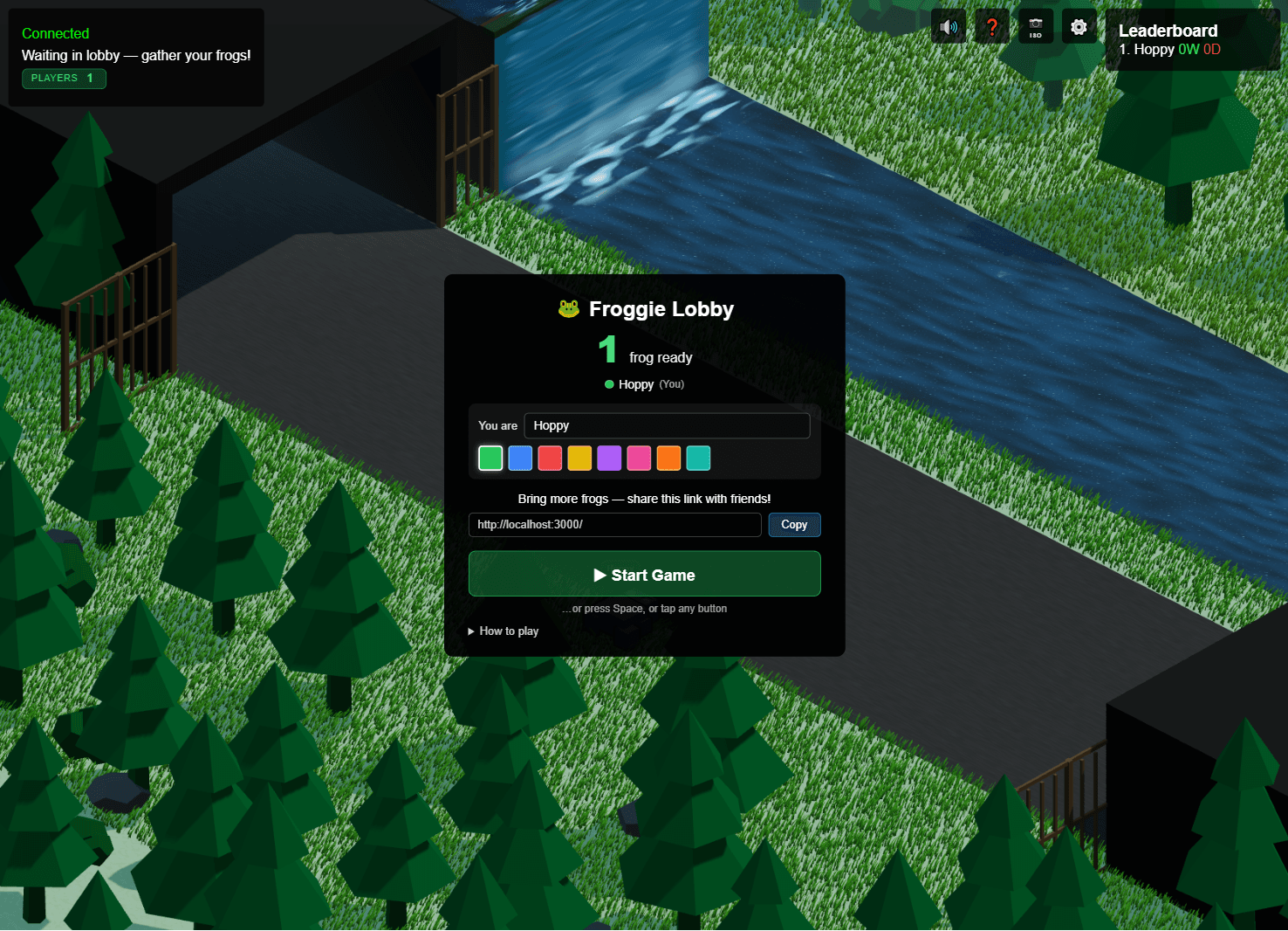
How a stranger gets into a session, on whatever device they brought.
One of the trickier parts of a small multiplayer game is the gap between the moment someone clicks a link you sent them and the moment they're actually playing. Two things help close that gap here: a waiting room that makes the session feel real before it starts, and a control scheme that gives phone players the full set of actions without covering the screen in buttons.
A waiting-room lobby
Before the game starts, players land in a lobby that shows the current roster, a copy-able invite link, and inline fields to edit their own name and color. The idea is to make a cold start feel like an actual room rather than an empty board: you can see who else is there, grab a link to pull a friend in, and set up your frog while you wait, instead of sitting on an empty board wondering whether anything is happening.
A mobile D-pad that also takes mouse input
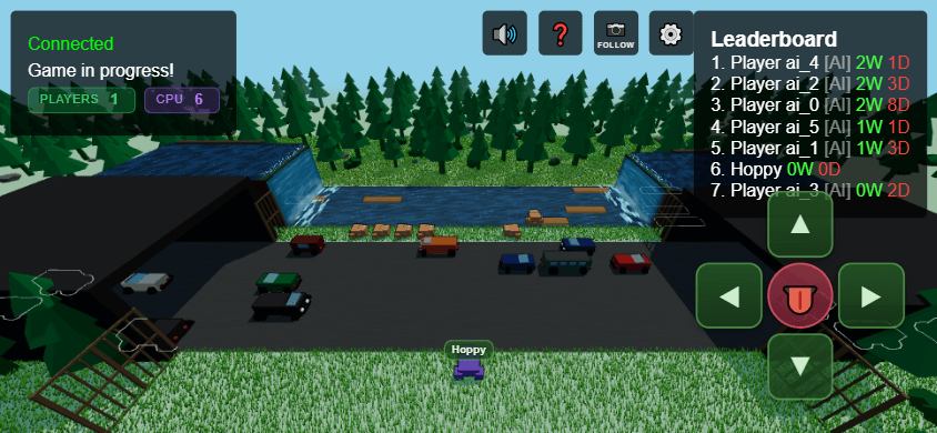
On a phone there's no keyboard, so a D-pad overlay handles directional input through touch events, and it also responds to mouse events so the same control works for a desktop developer testing in emulation. It sits behind a settings toggle so desktop players can hide it completely.
A tongue button with a cooldown
The tongue attack knocks an adjacent frog back, and since it's the one player-versus-player action in the game, it needed its own button on mobile. The actual design decision was the cooldown length. If it's too short, players just spam each other off the logs constantly, and if it's too long, nobody bothers using it. The value I landed on is short enough to feel responsive but long enough that firing it is a real decision, and the button reuses the same event handling as the D-pad so the two don't interfere with each other.
Looking back at the project.
Frogger MP started as an experiment. I'd wanted to design a video game for years but had always treated it as out of reach, since it seemed to need more engineering than I had, and a lot of the project was seeing how far I could get by iterating my way through it. The reason it's in the portfolio is that the design decisions are unusually easy to see here. A lot of my production work ends up buried in meeting notes and design docs, where the reasoning is hard to point back to later, whereas with this project the decisions are right there in how it plays.
A lot of the habits I lean on at work show up across these five sections: building a way to see what's happening before trying to tune it, making a constraint visible so I can actually work against it, and leaving some things for the player to pick up on without spelling them out. Frogger didn't teach me any of that, but it's probably the clearest place I can point to where all of it is on display at once.
And it is genuinely fun, which is the other reason it is here. Go play it.